Linear's issue detail view: a masterclass in content-first hierarchy
A close look at how Linear's issue detail screen uses three opacity tiers, whitespace as grammar, sidebar field ordering, and hover-reveal micro-interactions to serve both readers and editors on the same screen — and what PMs can extract from each decision.

Every issue-tracker puts a title at the top. Linear's issue detail view earns attention by making that a deliberate system — one where every opacity value, every field order, and every unlabeled icon is a decision you can trace back to a design principle. This first teardown focuses on a single screen: the issue detail view, specifically the three-column layout of main content / activity feed / metadata sidebar.
Information hierarchy: three opacity tiers, not three font sizes
Most tools create hierarchy through font size. Linear creates it through opacity and weight simultaneously, which produces a much finer-grained ladder:
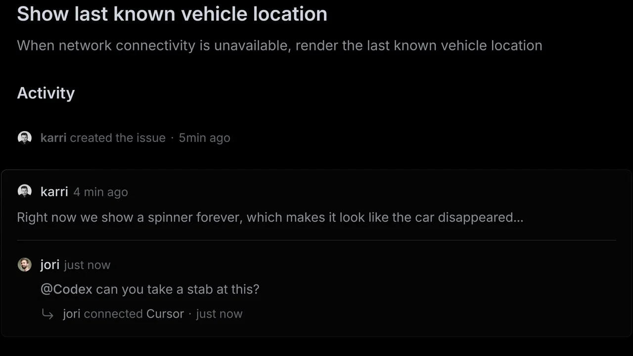
- Tier 1 — The title: large, full-opacity, muted grey (not pure black). Not
font-weight: 700. Just generous size, full opacity, and strong leading. The restraint here is deliberate: a jet-black H1 would dominate the screen so hard nothing else could breathe. - Tier 2 — The description: regular body weight at normal opacity. It sits flush under the title with a clear vertical gap — no section label, no divider. The separation is entirely spatial.
- Tier 3 — System labels ("Activity"): this is the counter-intuitive move. The word "Activity" appears in a noticeably lighter weight and lighter grey than both the title and body text. It's less visually prominent than even a comment timestamp. The label's job is to signal a section boundary, not to be read.
The practical result: when a PM opens an issue, their eye lands on the title, reads the description, then scans the activity without having to consciously locate it. No visual hierarchy tutorial is needed. The grey-on-grey gradient of descending importance does the work.
Linear's design team confirmed this intent in their March 2024 redesign write-up: the goal was explicitly to "reduce visual noise, maintain visual alignment, and increase the hierarchy and density" across all views — and to increase content contrast in light mode so "text and neutral icons are darker" in service of the content, not the chrome. 2
Whitespace: the gap does the grammar work
The issue detail view uses whitespace in a specific pattern that's worth mapping precisely.
Between the title and description, there's a narrow gap — maybe 8–12px. These are semantically the same unit (the issue), so tight spacing reinforces that relationship.
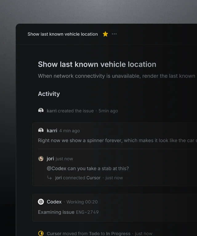
Between the description and the Activity header, there's a much larger gap — visually closer to 32–40px. This is the boundary between "what the issue is" and "what has happened to it." No divider line. No background color shift. Just white space carrying all the grammatical weight of a paragraph break.
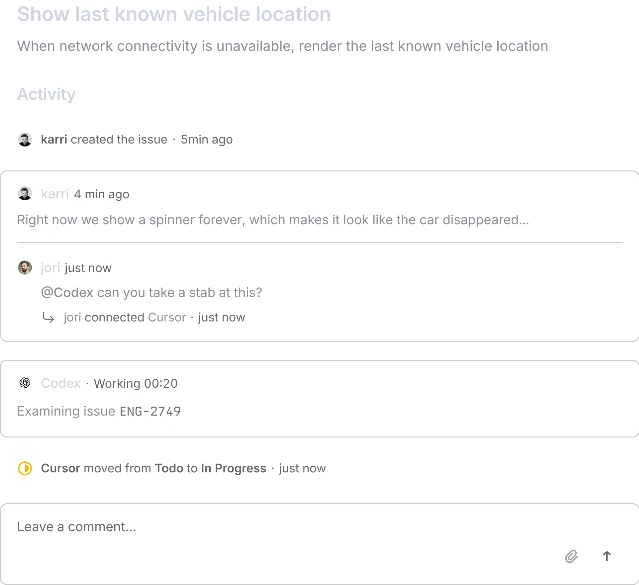
Within the activity feed, individual standalone events (e.g., "karri created the issue · 5min ago") use bare whitespace around them. Comment cards, by contrast, get a light border and slightly elevated background. The visual treatment directly maps to semantic weight: someone typed words → gets a container; the system logged a state change → gets none.
This is a design pattern borrowed from editorial typography — the idea that structural punctuation (paragraph breaks, section breaks) can be spatial rather than graphical. Most product UIs reach for dividers and background fills because they're safer; white space requires trusting your type scale and spacing system enough to let air carry meaning.
The sidebar: field order as workflow encoding
The metadata sidebar is the most intellectually interesting part of this screen. Look at the field order:
- Status (with color-coded icon)
- Priority (with density-bar icon)
- Assignee (avatar)
- Agent (connected AI agent, with a curved connector line linking it to Assignee)
- Labels (pill with color dot)
- Cycle
- Project
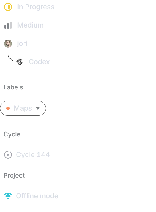
The order follows a single principle: fields you update most often sit at the top. Status and priority change many times per sprint. Labels, cycle, and project change once or rarely. Linear is encoding your expected interaction frequency into a spatial ranking.
Notice what's absent: section headers. In Jira or Asana, the sidebar would group these into labeled sections — "Details," "Dates," "Relationships." Linear trusts the icon to carry enough meaning that a label is redundant. Status has a half-circle progress icon; priority has signal-bar icons. You read the icon, not a word.
The newest element — the AI agent field — is visually connected to Assignee with a curved line. This isn't an accident. The curved connector says: "this is who is doing the work on behalf of the human above." It's a spatial relationship that encodes the human-AI delegation model without any explanatory copy. The field doesn't say "AI sub-assignee" or "delegated to." The arc does the explaining.
State changes: the activity feed's two visual registers
Linear's activity feed handles two fundamentally different event types on the same timeline:
System events (state changes, created timestamps, connected agents): rendered as a single line of text with an icon. No card, no container, no avatar prominence. Just
icon + actor + verb + timestamp in muted grey.Human/AI authored content (comments, agent status reports): rendered inside a soft-bordered card with a visible separator between consecutive entries from different authors. Inside a multi-person card group, a thin horizontal rule separates messages — the card container signals "these belong together"; the rule signals "but they're from different people."
The practical implication: when scanning an issue's history, your eye automatically distinguishes between "what happened" (state transitions, assignments) and "what was said" (the human deliberation layer). Most trackers render both at equal visual weight, which means you have to read every line to determine its type. Linear gets that distinction for free from whitespace and container decisions alone.
Micro-interactions: hover-reveal and the ghost layer
The issue detail view has almost nothing interactive visible at rest. Most action affordances appear only on hover — the icon buttons for editing the title, the reaction emoji trigger on comments, the dropdown chevrons on sidebar fields.
This is a deliberate density trade-off. The screen serves two distinct modes: reading (most of the time) and editing (occasional). Showing edit controls at rest would add visual noise that clutters the reading mode. Hiding them behind hover preserves a clean reading surface while keeping actions immediately reachable.
The sidebar fields are a clean example. At rest, each field shows only an icon and its value — "In Progress," "Medium," "jori." On hover, a subtle highlight and dropdown arrow appear. This means a non-interactive scan of an issue's metadata is completely chrome-free. You get the information without the affordances of interacting with it.
The risk of this pattern is discoverability — a new user might not realize a field is editable. Linear bets that its target audience (experienced PMs and engineers at fast-moving teams) will figure it out quickly, and that the reward of a clean reading surface is worth the short learning curve. That's a product-positioning bet as much as a design decision.
The PM takeaway: designing for two roles on one screen
The issue detail view is simultaneously a communication artifact (this is what we need to build, here's the context) and a workflow state machine (who owns it, what stage it's in, which sprint and project it belongs to). Most tools optimize for one and neglect the other.
Linear handles the tension by treating these two roles as spatially separated: the main column is for the communication artifact, the sidebar is for the state machine. The two halves use different visual languages — full prose and discussion threads on the left, icon-first compact fields on the right — and they never bleed into each other.
Every design decision traced above — the three opacity tiers, the whitespace grammar, the field order, the two-register activity feed, the hover-reveal chrome — is downstream of that fundamental architectural choice.
Tomorrow: Stripe's payment detail page and how it handles the density problem of showing 20+ data points without a grid.
Add more perspectives or context around this Post.